
On the National Day of Civic Hacking, 2016, OpenJustice Fellows worked with volunteers from Code for America, San Francisco, to develop user-friendly visualizations for the OpenJustice site. The results were then implemented as enhancements to the OpenJustice site. This tutorial provides users step by step instructions on how to adapt an opensource D3 visualization for use with data from the CA Department of Justice, and by extension, for other projects.
This work exemplifies how OpenJustice is actively built with and by the community, and also the efforts of the CA Department of Justice to advance the use of data and evidence to promote public understanding and engagement with the criminal justice system. Contact us at Openjustice@doj.ca.gov.
introduction
As of June 2016, the OpenJustice charts page consisted of static bubble charts with various combinations of criminal justice indicators. While it had filters that allowed for exploration of the chart by year, it was difficult for users to get a sense for how the indicators had changed over time. This tutorial shows how to adapt an open source inspiration to create an interactive visualization that shows the evolution of criminal justice indicators in the 58 counties of California. The dataset can be downloaded from the OpenJustice data portal.
Objective: Develop a more effective visualization
Consider the following visualization from the OpenJustice website:
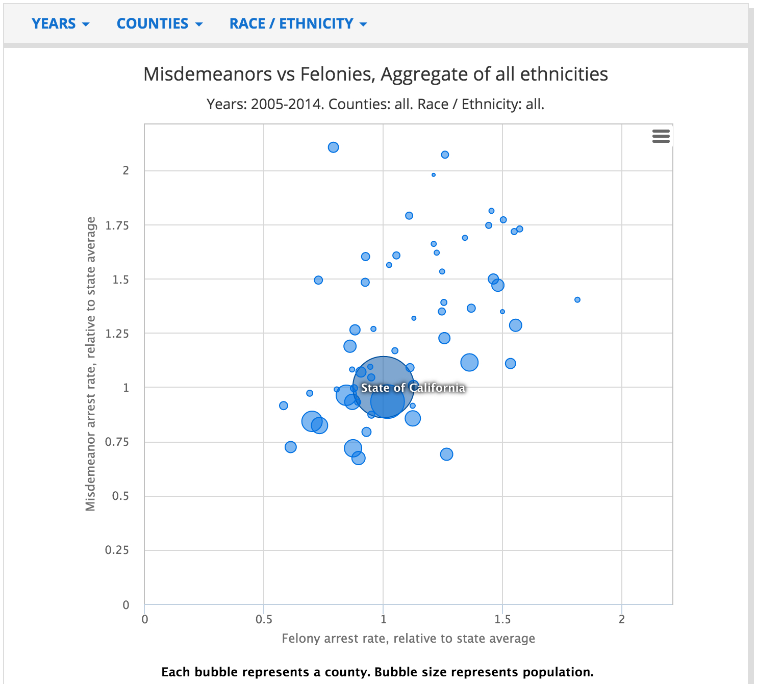
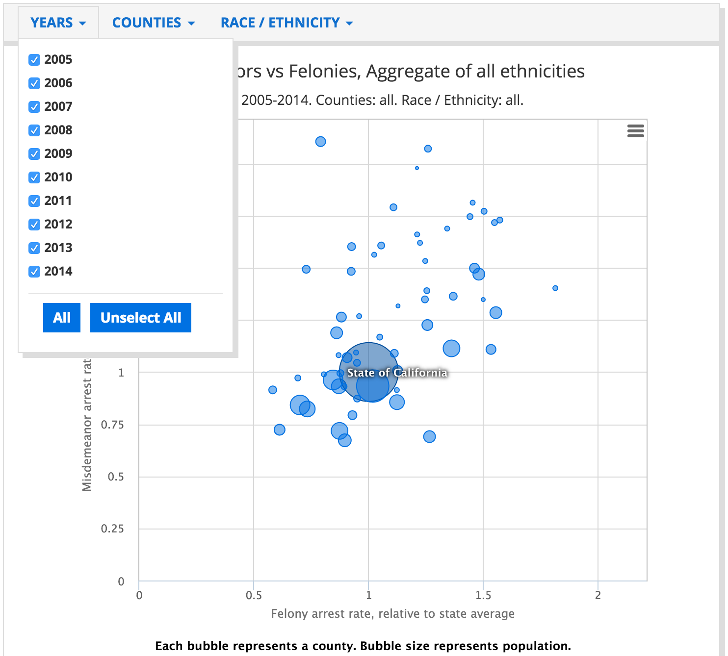
The user can see how California counties compare on normalized rates of misdemeanor and felony arrests. While the chart can be explored for different years by using the filter menu, it is not effective in helping the user clearly see how these county indicators have evolved over time.
How can we build a more effective, user-friendly visualization?
Inspiration for Improvement
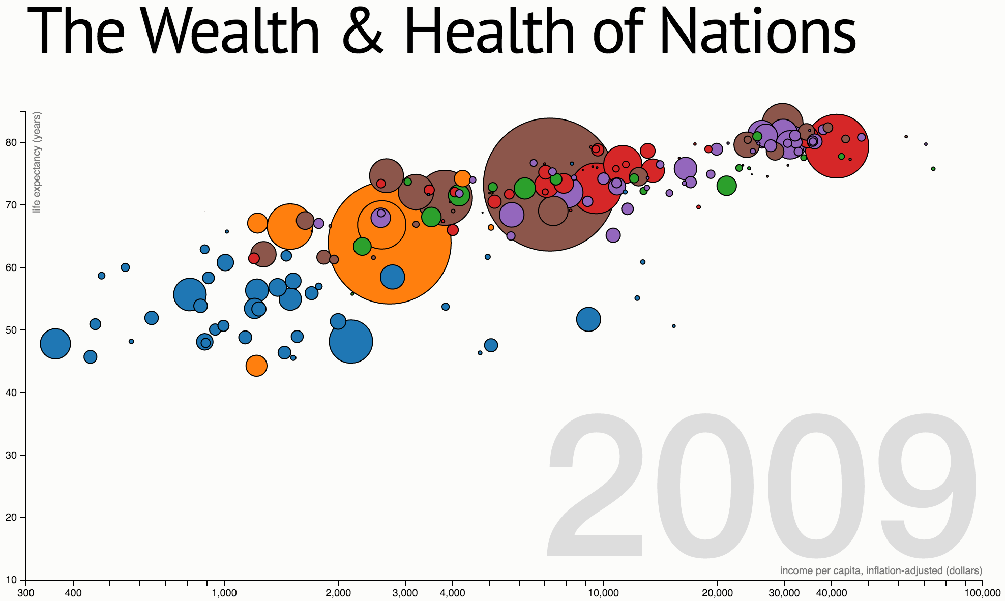
The interactive animation The Wealth & Health of Nations suggests one possibility: displaying the set of values one year at a time and animating the year automatically to show trends over time. It also allows the user to manually animate the time parameter for conducting analysis:
Original code for visualization
This is the javascript source code for 'The Wealth and Health of Nations' chart, available from the same page.
function x(d) { return d.income; }
function y(d) { return d.lifeExpectancy; }
function radius(d) { return d.population; }
function color(d) { return d.region; }
function key(d) { return d.name; }

// Chart dimensions.
var margin = {top: 19.5, right: 19.5, bottom: 19.5, left: 39.5},
    width = 960 - margin.right,
    height = 500 - margin.top - margin.bottom;

// Various scales. These domains make assumptions of data, naturally.
var xScale = d3.scale.log().domain([300, 1e5]).range([0, width]),
    yScale = d3.scale.linear().domain([10, 85]).range([height, 0]),
    radiusScale = d3.scale.sqrt().domain([0, 5e8]).range([0, 40]),
    colorScale = d3.scale.category10();

// The x & y axes.
var xAxis = d3.svg.axis().orient("bottom").scale(xScale).ticks(12, d3.format(",d")),
    yAxis = d3.svg.axis().scale(yScale).orient("left");

// Create the SVG container and set the origin.
var svg = d3.select("#chart").append("svg")
    .attr("width", width + margin.left + margin.right)
    .attr("height", height + margin.top + margin.bottom)
  .append("g")
    .attr("transform", "translate(" + margin.left + "," + margin.top + ")");

// Add the x-axis.
svg.append("g")
    .attr("class", "x axis")
    .attr("transform", "translate(0," + height + ")")
    .call(xAxis);

// Add the y-axis.
svg.append("g")
    .attr("class", "y axis")
    .call(yAxis);

// Add an x-axis label.
svg.append("text")
    .attr("class", "x label")
    .attr("text-anchor", "end")
    .attr("x", width)
    .attr("y", height - 6)
    .text("income per capita, inflation-adjusted (dollars)");

// Add a y-axis label.
svg.append("text")
    .attr("class", "y label")
    .attr("text-anchor", "end")
    .attr("y", 6)
    .attr("dy", ".75em")
    .attr("transform", "rotate(-90)")
    .text("life expectancy (years)");

// Add the year label; the value is set on transition.
var label = svg.append("text")
    .attr("class", "year label")
    .attr("text-anchor", "end")
    .attr("y", height - 24)
    .attr("x", width)
    .text(1800);

// Load the data.
d3.json("nations.json", function(nations) {

  // A bisector since many nation's data is sparsely-defined.
  var bisect = d3.bisector(function(d) { return d[0]; });

  // Add a dot per nation. Initialize the data at 1800, and set the colors.
  var dot = svg.append("g")
      .attr("class", "dots")
    .selectAll(".dot")
      .data(interpolateData(1800))
    .enter().append("circle")
      .attr("class", "dot")
      .style("fill", function(d) { return colorScale(color(d)); })
      .call(position)
      .sort(order);

  // Add a title.
  dot.append("title")
      .text(function(d) { return d.name; });

  // Add an overlay for the year label.
  var box = label.node().getBBox();

  var overlay = svg.append("rect")
        .attr("class", "overlay")
        .attr("x", box.x)
        .attr("y", box.y)
        .attr("width", box.width)
        .attr("height", box.height)
        .on("mouseover", enableInteraction);

  // Start a transition that interpolates the data based on year.
  svg.transition()
      .duration(30000)
      .ease("linear")
      .tween("year", tweenYear)
      .each("end", enableInteraction);

  // Positions the dots based on data.
  function position(dot) {
    dot .attr("cx", function(d) { return xScale(x(d)); })
        .attr("cy", function(d) { return yScale(y(d)); })
        .attr("r", function(d) { return radiusScale(radius(d)); });
  }

  // Defines a sort order so that the smallest dots are drawn on top.
  function order(a, b) {
    return radius(b) - radius(a);
  }

  // After the transition finishes, you can mouseover to change the year.
  function enableInteraction() {
    var yearScale = d3.scale.linear()
        .domain([1800, 2009])
        .range([box.x + 10, box.x + box.width - 10])
        .clamp(true);

    // Cancel the current transition, if any.
    svg.transition().duration(0);

    overlay
        .on("mouseover", mouseover)
        .on("mouseout", mouseout)
        .on("mousemove", mousemove)
        .on("touchmove", mousemove);

    function mouseover() {
      label.classed("active", true);
    }

    function mouseout() {
      label.classed("active", false);
    }

    function mousemove() {
      displayYear(yearScale.invert(d3.mouse(this)[0]));
    }
  }

  // Tweens the entire chart by first tweening the year, and then the data.
  // For the interpolated data, the dots and label are redrawn.
  function tweenYear() {
    var year = d3.interpolateNumber(1800, 2009);
    return function(t) { displayYear(year(t)); };
  }

  // Updates the display to show the specified year.
  function displayYear(year) {
    dot.data(interpolateData(year), key).call(position).sort(order);
    label.text(Math.round(year));
  }

  // Interpolates the dataset for the given (fractional) year.
  function interpolateData(year) {
    return nations.map(function(d) {
      return {
        name: d.name,
        region: d.region,
        income: interpolateValues(d.income, year),
        population: interpolateValues(d.population, year),
        lifeExpectancy: interpolateValues(d.lifeExpectancy, year)
      };
    });
  }

  // Finds (and possibly interpolates) the value for the specified year.
  function interpolateValues(values, year) {
    var i = bisect.left(values, year, 0, values.length - 1),
        a = values[i];
    if (i > 0) {
      var b = values[i - 1],
          t = (year - a[0]) / (b[0] - a[0]);
      return a[1] * (1 - t) + b[1] * t;
    }
    return a[1];
  }
});
Code Changes
Certain parameters of the visualization such as axes, year labels and their variables along with the axes scales need to be changed, as below:
Updated Variable names
function x(d) { return d.felony; }
function y(d) { return d.misdemeanor; }
function radius(d) { return d.population; }
function color(d) { return d.county; }
function key(d) { return d.county; }

function interpolateData(year) {
return counties.map(function(d) {
return {
county: d.county,
felony: parseFloat(interpolateValues(d.felony, year)).toFixed(2),
population: Math.round(interpolateValues(d.population, year)),
misdemeanor: parseFloat(interpolateValues(d.misdemeanor, year)).toFixed(2)
};
});
}
Updated Year Label
var year = d3.interpolateNumber(2005, 2014);
Updated Axes
var xScale = d3.scale.linear().domain([0, 3]).range([0, width]),
yScale = d3.scale.linear().domain([0, 3.5]).range([height, 0]),
radiusScale = d3.scale.sqrt().domain([0, 4e6]).range([0, 40]),
Input Data Preparation
Since the javascript accepts input data in a particular json format, we wrote a python script to convert a csv file to the required format, as follows:
import csv
import json
import sys, getopt


//To run (from inside this directory):
python data_converter.py -i ../data/data_clean.csv -o ../data/test.json
(from main directory)
python scripts/data_converter.py -i data/data_clean.csv -o data/test.json

def main(argv):
  input_file = ''
  output_file = ''
  try:
      opts, args = getopt.getopt(argv,"hi:o:",["ifile=","ofile="])
  except getopt.GetoptError:
      print('data_converter.py -i <'path to inputfile'> -o <'path to outputfile'>')
      sys.exit(2)
  for opt, arg in opts:
      if opt == '-h':
          print('data_converter.py -i <'path to inputfile'> -o <'path to outputfile'>')
          sys.exit()
      elif opt in ("-i", "--ifile"):
          input_file = arg
      elif opt in ("-o", "--ofile"):
          output_file = arg
  csv_to_json(input_file, output_file)

def csv_to_json(file, json_file):
  csv_rows = []
  with open(file) as csvfile:
    reader = csv.DictReader(csvfile)
    title = reader.fieldnames
    counties = {}

    for row in reader:
      if row['county'] in counties:
        counties[row['county']]['felony'].append([int(row['year']), float(row['felony'])])
        counties[row['county']]['misdemeanor'].append([int(row['year']), float(row['misdemeanor'])])
        counties[row['county']]['population'].append([int(row['year']), int(row['population'])])

      else:
        counties[row['county']] = {'county': row['county']}
        counties[row['county']]['felony'] = [[int(row['year']), float(row['felony'])]]
        counties[row['county']]['misdemeanor'] = [[int(row['year']), float(row['misdemeanor'])]]
        counties[row['county']]['population'] = [[int(row['year']), int(row['population'])]]


    print(counties.values())
    write_json(list(counties.values()), json_file)


def write_json(data, json_file):
  with open(json_file, "w") as f:
    f.write(json.dumps(data, sort_keys=True, indent=4, separators=(',', ': '),ensure_ascii=False))

if __name__ == "__main__":
   main(sys.argv[1:])
Final Visualization
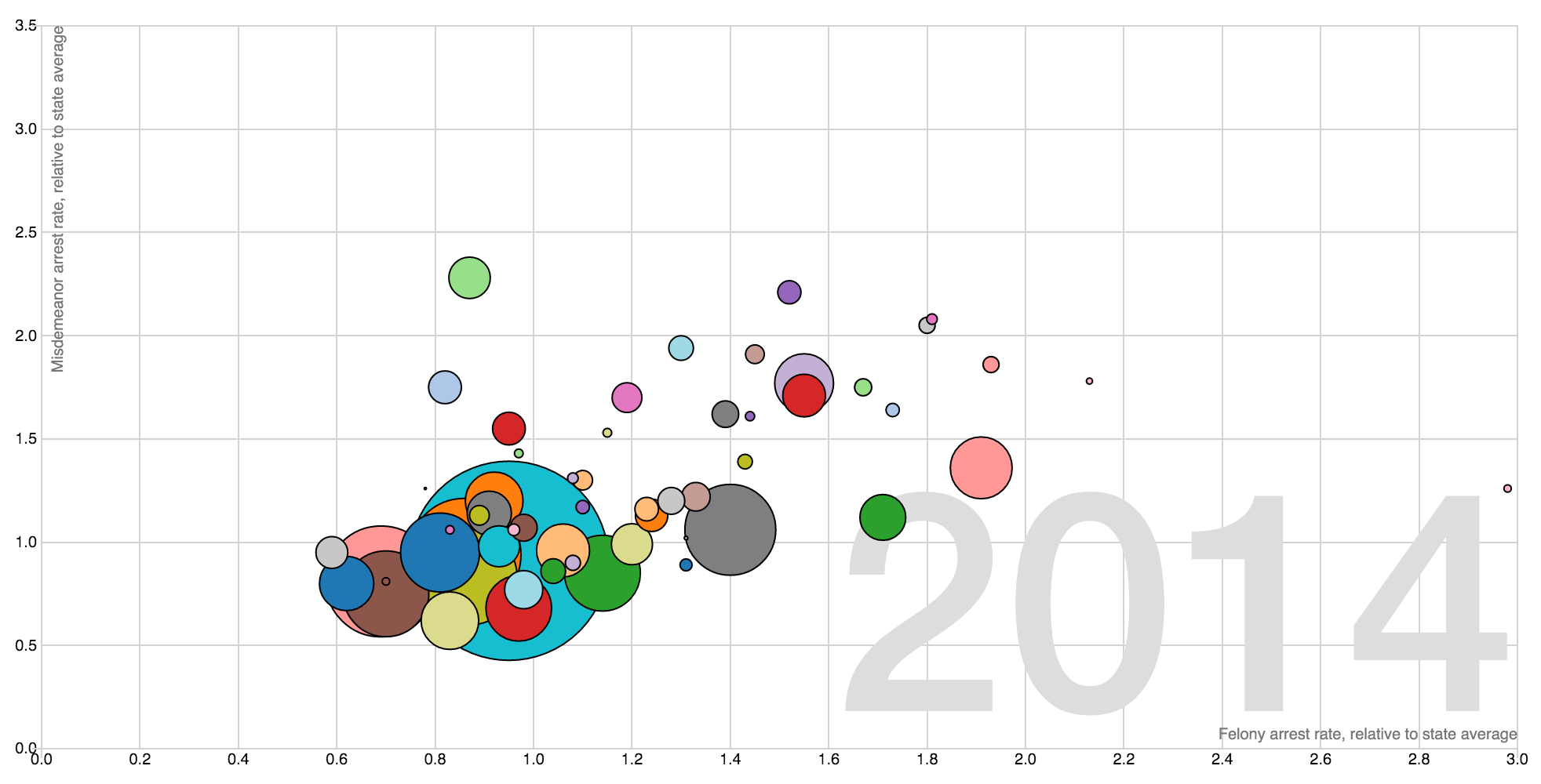
And we have it! The resulting visualization can be found here, here's a snapshot:
To get started quickly, the complete code for this visualization can be found at the following Github repo.